
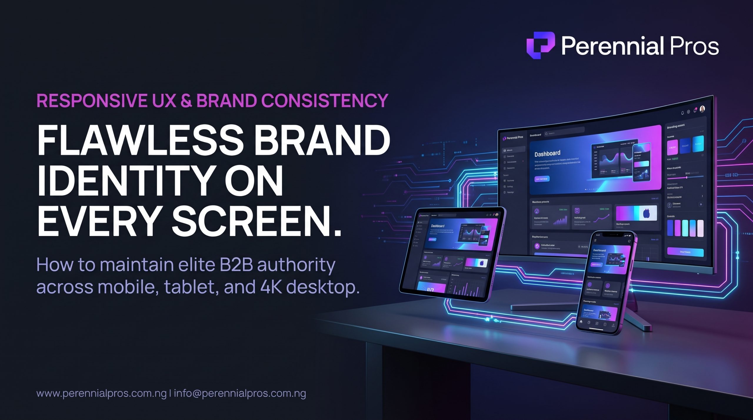
In high-value B2B relationships and professional services, trust is fragile. Long before an executive buyer reads your case studies, analyzes your pricing structure, or books a discovery call, they evaluate your competence through visual and functional cues.
When a decision maker clicks your link from a LinkedIn post on their mobile phone, reviews your proposal on an iPad during transit, and later pulls up your site on a 32-inch 4K desktop monitor, they expect a seamless, flawless experience.
If your layout stretches awkwardly on an ultra-wide screen, your typography breaks into illegible fragments on a smartphone, or your logo looks blurry on a high-density Retina display, the perception of authority collapses.
A premium brand is not just a high-end visual design, it is an operational standard of consistency across the entire hardware spectrum. Here is how to engineer a digital presence that commands authority on every modern viewport.
1. Move Beyond Basic Responsiveness to Adaptive Viewport Architecture
Basic responsive web design used to mean stacking three desktop columns into one long vertical scroll on mobile devices. Today, that approach is obsolete.
Modern viewports range from 360-pixel mobile devices to 4K ultra-wide monitors (2560px and beyond). A truly premium website must actively adapt its visual hierarchy to each environment:
- Ultra-Wide and Large Desktop Screens ($>1440\text{px}$): Unconstrained web layouts look sparse and uncalibrated on 4K monitors. Implement a maximum container width (
max-width: 1280pxto1400px) with automatic horizontal margins. This anchors your content, preserves balanced white space, and prevents text lines from stretching into unreadable widths. - Laptops and Standard Desktops ($1024\text{px}$ to $1440\text{px}$): This is the natural environment for multi-column comparison tables, structured dashboard previews, and side-by-side feature breakdowns.
- Tablets and Foldables ($768\text{px}$ to $1023\text{px}$): Treat tablets as touch-first devices, not smaller laptops. Ensure interactive UI elements, navigation drawers, and dropdown menus respond cleanly to tap interactions rather than desktop hover states.
- Mobile Smartphones ($<768\text{px}$): Streamline information density. Prioritize immediate value delivery, legible typography, and direct contact avenues without forcing visitors through unnecessary visual obstacles.
2. Eliminate Visual Degradation with High-Density Asset Standards
Nothing shatters a premium aesthetic faster than a pixelated logo or blurry icons on modern high-DPI (Retina, Super AMOLED) displays. These screens pack double or triple the physical pixels into every square inch.
To maintain razor sharp visual fidelity:
- Vector First for Identity Assets: Always serve brand logos, icon libraries, and diagram outlines as Scalable Vector Graphics (
.svg). SVGs calculate paths mathematically, rendering with absolute crispness at any resolution, zoom level, or screen density without increasing file size. - Modern Raster Image Formats: For photographs, client mockups, and complex editorial imagery, use next-generation formats like WebP and AVIF. They deliver superior color depth and high-resolution clarity at up to 50% smaller file sizes compared to traditional JPEGs and PNGs.
- Implement Responsive
srcsetAttributes: Never serve a full-resolution 4K desktop hero image to a mobile phone on a cellular connection. Use HTMLsrcsetattributes to deliver the exact image resolution matched to the visitor’s screen width and pixel ratio, preventing mobile layout stalls.
3. Implement Fluid Typography and Dynamic Spacing
Static font sizes cause severe layout compromises. A 48px heading that commands attention on a 27-inch desktop will overwhelm a smartphone screen, pushing your core value proposition entirely out of view.
Instead of declaring rigid pixel values across multiple breakpoints, implement modern fluid sizing using CSS clamp:
$$\text{font-size} = \text{clamp}(\text{min\_size}, \text{viewport\_scaling}, \text{max\_size})$$
CSS
/* Example: Headline scales smoothly from 32px on mobile to 52px on desktop */
h1 {
  font-size: clamp(2rem, 1.5rem + 2.5vw, 3.25rem);
  line-height: 1.15;
}
Fluid typography scales smoothly with the viewport, eliminating sudden visual jumps between screen sizes and ensuring your visual hierarchy remains balanced across phones, tablets, and desktops.
4. Master the Mobile “Thumb Zone” for Key Actions
Over 60% of B2B web traffic originates from mobile devices. However, many desktop-centric websites force mobile users into awkward interactions: tiny navigation links, misplaced conversion buttons, and hard-to-tap form fields.
Premium mobile execution respects the biomechanics of how people hold their phones:
| Touchpoint Component | Desktop Execution | Premium Mobile Standard |
| Primary Conversion Button | Fixed in hero or top-right header | Large, full-width button or a subtle sticky bottom dock in the natural thumb zone |
| Touch Target Dimensions | Standard mouse click targets | Minimum 44 × 44 px interactive tap zones to eliminate mis-clicks |
| Navigation Menu | Horizontal text links | Clean full-screen modal or bottom sheet with generous vertical micro-spacing |
| Forms & Calendars | Multi-column grid | Single-column linear layout with native mobile keyboard triggers (e.g., type="tel", inputmode="email") |
When every button, input field, and menu item is effortless to tap with one thumb, your website projects deliberate care and professionalism.
5. Eliminate Device-Specific “Micro-Friction”
The difference between an average website and an elite digital presence lies in how minor edge cases are handled across various hardware and operating systems:
- Audit Dark Mode System Triggers: Many modern devices automatically trigger dark mode based on user preferences. If your site does not account for this, transparent logos can vanish into dark backgrounds or unstyled form fields can display illegible text. Ensure your brand tokens adapt predictably to system-level color scheme preferences.
- Prevent Unwanted Horizontal Shift: A single oversized image, unconstrained code block, or misplaced absolute element can cause mobile pages to wobble horizontally. Ensure your containers enforce strict overflow controls (
overflow-x: hidden) so the viewport remains locked vertically. - Test on Physical Devices, Not Just Emulators: Browser developer tools are excellent for quick layout checks, but they do not emulate real-world touch latency, notch cutouts, keyboard pop-ups, or performance bottlenecks under real mobile processor constraints. Always audit your core customer journey on actual iOS and Android hardware.
Consistency Commands Authority
Your website is often the first and most critical touchpoint in your client acquisition pipeline. When your digital experience displays identical visual precision, rapid loading velocity, and effortless navigation whether viewed on a flagship smartphone or an executive boardroom monitor, your authority becomes self-evident.
At Perennial Pros, we design, develop, and optimize high-performance B2B digital platforms and automated operational systems engineered to look world-class, perform reliably on every modern device, and convert qualified traffic into revenue.
Ready to elevate your digital presence and ensure your brand looks exceptional everywhere?
👉 Contact the Perennial Pros team today to audit your website’s multi-device performance and engineer a seamless, high-converting digital platform.