
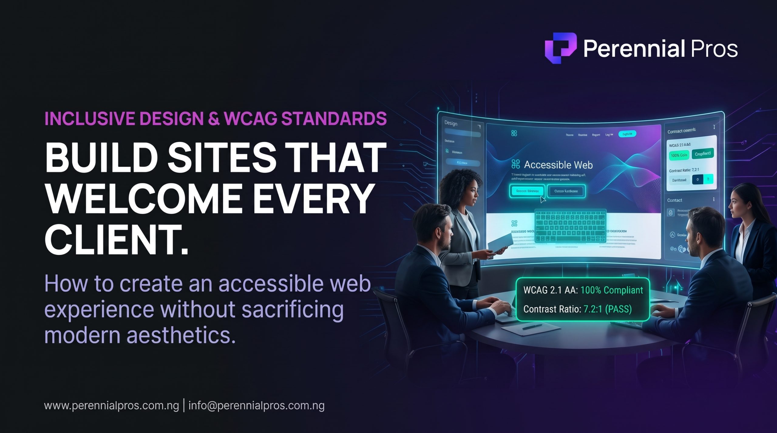
When businesses invest in website design, the discussion almost exclusively revolves around aesthetics, conversion velocity, and SEO rankings. Yet, a critical factor that directly influences usability, legal compliance, and bottom-line revenue is frequently overlooked: web accessibility.
According to the World Health Organization (WHO), roughly 1.3 billion people, 16% of the global population experience significant disability. In the digital world, this encompasses visual impairments, motor challenges, hearing difficulties, and cognitive processing differences.
When your website ignores accessibility standards, you are not merely failing a theoretical checklist; you are actively turning away qualified buyers, driving up bounce rates, and signaling that your brand values surface polish over functional excellence.
Accessibility is not a cosmetic compromise. Accessible design is simply good design, it improves usability for every visitor, accelerates site performance, and strengthens search engine visibility. Here is the operational blueprint to build an accessible website that welcomes every potential client.
1. Ground Your Build in WCAG Principles (POUR)
The global gold standard for digital accessibility is the Web Content Accessibility Guidelines (WCAG). These standards are anchored by four core principles, known by the acronym POUR:
- Perceivable: Information and UI components must be presentable in ways users can perceive. If content exists only as an image or audio track without an alternative format, it is invisible to a subset of your audience.
- Operable: Interface components and navigation must be operable using various inputs. Users must be able to complete every key action from browsing a menu to booking a discovery call using only a keyboard.
- Understandable: Content, information flow, and UI controls must be intuitive, predictable, and clear. Users should never be left guessing what a button does or where an error occurred.
- Robust: Your code must be clean and standardized enough to be interpreted reliably by a wide range of user agents, including modern assistive technologies like screen readers and speech-input software.
Most commercial compliance frameworks target WCAG 2.1 Level AA, which strikes the practical balance between rigorous inclusion and modern design aesthetics.
2. Eliminate Color Contrast and Readability Barriers
Visual clarity is the first test of an accessible interface. Low-contrast design trends such as light gray text on white backgrounds or subtle dark purple on dark slate might look sleek in a design mockup, but they create severe cognitive strain for real users.
- Enforce Strict Contrast Ratios: Under WCAG AA standards, normal body text requires a minimum contrast ratio of 4.5:1 against its background. Large text (18pt or 14pt bold) requires at least 3:1.
- Do Not Rely on Color Alone: If an error occurs on an intake form, turning the field border red is insufficient. Users with color vision deficiencies need an explicit icon and descriptive error text (e.g., “Please enter a valid work email”).
- Protect Typographic Hierarchy: Maintain a logical heading structure ($H1 \rightarrow H2 \rightarrow H3$). Assistive screen readers rely on heading tags to map page structure and let users jump directly to relevant sections. Skipping levels (e.g., jumping from an $H1$ directly to an $H4$) breaks this navigation sequence.
3. Implement Intentional Keyboard Navigation and Focus States
Not every visitor uses a trackpad or mouse. Many users including executives navigating rapidly with external keyboards and individuals with motor control challenges navigate exclusively using the Tab, Shift + Tab, and Enter keys.
- Never Suppress Focus Outlines: Many web developers remove the default browser focus ring (
outline: none) because they consider it unappealing. This is a severe usability mistake. If a user cannot see where their cursor is focused, your site becomes impossible to navigate. Use custom, high-visibility focus states styled to complement your brand palette. - Preserve Logical Tab Order: Ensure the keyboard tab sequence mirrors the visual layout of your page. Tabbing through your site should flow naturally from top to bottom, left to right.
- Add a “Skip to Content” Link: For complex websites with multi-tier header menus, embed a hidden “Skip to main content” button at the very top of the HTML DOM. This allows keyboard users to bypass repetitive navigation bars and jump straight to your primary value proposition.
4. Provide Descriptive, Contextual Alternative Text (Alt Text)
Screen readers cannot interpret raw images without text descriptions. However, treating image alt text as an SEO keyword stuffing field damages accessibility.
- Descriptive Over Promotional: Write concise alt text that explains the function and meaning of the image within the context of the page.
- Informational vs. Decorative: If an image delivers actionable information (such as a conversion funnel flowchart or revenue attribution model), describe that workflow clearly in the alt tag or supporting body copy. If an image is purely decorative (such as subtle background circuit traces or geometric accent ribbons), set an empty alt attribute (
alt="") so screen readers skip it cleanly. - Avoid Redundant Phrases: Screen readers automatically announce an image before reading its tag. Phrases like “Image of…” or “Graphic showing…” create repetitive noise.
5. Build Inclusive, Low-Friction Form Architectures
Your contact forms and booking funnels are where accessibility directly impacts pipeline revenue. If a prospect encounters barriers during form submission, they will abandon the process entirely.
| Form Element | The Inaccessible Mistake | The Accessible Standard |
| Field Labels | Relying solely on disappearing placeholder text | Persistent, visible <label> tags linked to each input via for and id attributes |
| Error Handling | Generic “Form submission failed” alerts | Clear inline error messages explaining exactly which field is invalid and how to resolve it |
| Hit Target Size | Tiny, cramped input boxes and submit buttons | Generous tap targets (minimum 44 × 44 px) with comfortable internal padding |
| Form Timing | Strict session timeouts that wipe entered data | No arbitrary session clocks, or simple mechanisms to extend time without data loss |
6. Conduct a 3-Step Accessibility Audit
You do not need an enterprise compliance team to identify the most glaring accessibility issues on your website. Run your site through this quick testing framework:
- The Keyboard-Only Run: Unplug your mouse or turn off your trackpad. Can you navigate your entire homepage, open dropdown menus, read through services, and submit your contact form using only the
Tab,Arrow, andEnterkeys? - Automated Contrast Scanning: Run your key conversion URLs through automated evaluation tools like Lighthouse or the WAVE extension to instantly catch contrast failures and missing label tags.
- Screen Reader Verification: Turn on native assistive tools (Apple VoiceOver or Windows Narrator) and close your eyes. Listen to how your hero section and booking flow are read aloud. Does the journey sound coherent, structured, and easy to follow?
Inclusivity Is an Operational Advantage
Accessibility is not a constraint on modern design; it is a discipline that enforces visual clarity, code cleanliness, and operational rigor. When you eliminate digital barriers, you expand your addressable market, protect your brand authority across touchpoints, and build a digital experience where every potential client can engage effortlessly.
At Perennial Pros, we design, build, and optimize high-converting digital platforms and automated web architectures engineered for performance, clean usability, and sustainable business growth.
Ready to eliminate friction and ensure your digital presence is built to convert every visitor?
👉 Contact the Perennial Pros team today to audit your website’s usability and build a modern, high-performing digital platform.