
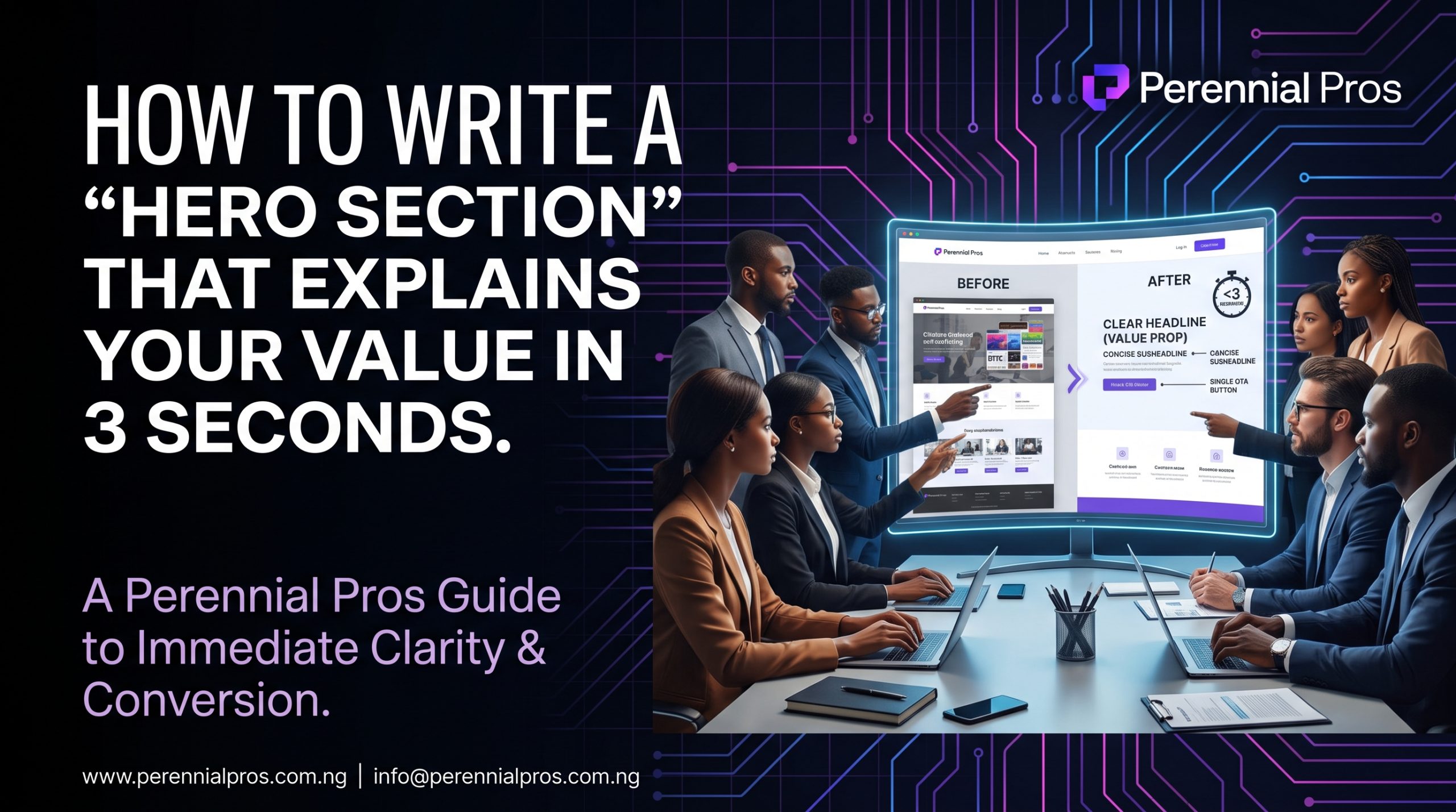
The hero section of your website, everything the user sees before scrolling carries a heavy burden.
It is your digital elevator pitch, your handshake, and your single best opportunity to convert a visitor into a lead. Yet, studies consistently show that you have roughly 3 seconds to make an impact. If a user doesn’t instantly understand who you are, what you solve, and what they must do next, they will hit the back button.
In those critical 3 seconds, the human brain isn’t reading; it is scanning for relevance and trust. To optimize this moment, you must engineering your headline, sub-headline, and Call-to-Action (CTA) for maximum impact and minimal friction.
The Core Blueprint of a 3-Second Hero Section
To pass the “3-second test,” your hero section must deliver complete clarity across four distinct psychological zones.
Zone 1: The Value Headline (The “What”)
Generic slogans fail. A headline that reads “Innovative Solutions for Global Excellence” says nothing and respects nobody’s time. Your headline must be outcome-driven, direct, and focused on the prospect’s desire.
- ❌ Weak: We are the leading marketing agency in Abuja.
- ✅ Strong: Acquire High-Value B2B Leads Using Predictable, Systems-Driven Marketing.
Use bold typography to ensure the headline is the single most dominant element on the page.
Zone 2: The Credibility Sub-Headline (The “How” or “For Whom”)
The sub-headline exists to validate the headline’s claim. It provides necessary context, qualifies the audience, or mentions a critical differentiator. Keep this block to two lines of text max.
- ❌ Weak: We have a great team and use modern tools.
- ✅ Strong: Our Perennial Pros framework helps Nigerian founders, consultancies, and digital leaders automate lead acquisition without hiring an internal team.
Zone 3: The Conversion Button (The “Next Step”)
A hero section without a primary CTA is merely decoration. If your headline and sub-headline do their jobs, the visitor needs to know exactly what action to take next. Use generous white space to make this button prominent and isolated from distractions.
- ❌ Weak: Contact Us
- ✅ Strong: Request a 20-Min diagnostic Call
Ensure this button has a high-contrast color that immediately draws the scanning eye.
Eliminating Digital Noise
The greatest enemy of a high-converting hero section is clutter. Every extraneous element, additional link, decorative graphic, or alternative navigation option introduces a mental speed bump.
- Apply Ruthless Macro White Space: Give your headline, copy blocks, and conversion button significant padding. White space projects authority and ensures focus.
- Reduce Competing Headlines: Eliminate rotating banners or flashing tickers. Multiple conflicting headlines generate decision paralysis.
- Match Visuals to Value: Generic stock photos of two people shaking hands dilute your premium brand identity. Use product screenshots, workflow diagrams, or custom graphics that actually illustrate the problem you solve or the outcome you deliver.
3 Seconds to Trust or Abandon
Your hero section isn’t about telling your whole story; it is about earning the right to tell the rest of it. In a crowded B2B and modern service market, clarity is your ultimate competitive advantage. By optimizing your headline, sub-headline, and conversion flow for immediate comprehension, you transform passive browsers into qualified leads[cite: 3].
At Perennial Pros, we design, develop, and optimize high-converting digital platforms and integrated business systems engineered for maximum conversion velocity.
Tired of losing qualified website traffic?
👉 Contact the Perennial Pros team today to audit your website’s conversion architecture and engineering a hero section that instantly captures attention.
That was amazing
Its Amazing
Hi,how are you