
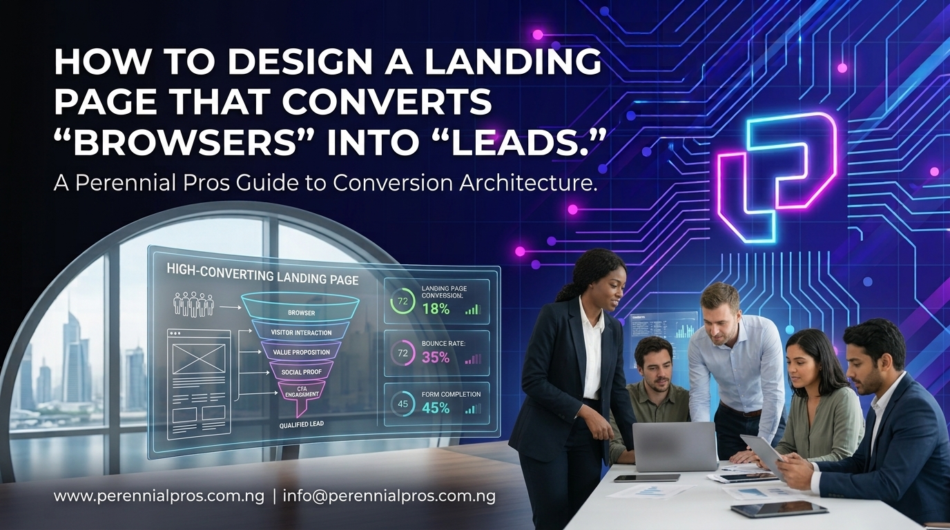
Driving traffic to a website is only half the battle. If your visitors bounce after five seconds of scrolling, you don’t have a traffic problem, you have a conversion architecture problem.
Most business landing pages read like digital brochures: crowded with technical jargon, generic stock images, multiple competing buttons, and weak value propositions. When visitors don’t instantly understand what you do, who it’s for, and how it solves their immediate pain point, they hit the back button.
Turning casual browsers into qualified inbound leads requires deliberate visual hierarchy, psychological clarity, and low-friction user experience (UX).
1. Win the 5-Second Test Above the Fold
The hero section (everything a visitor sees before scrolling) carries the heaviest burden. If a prospect cannot answer three basic questions within five seconds, they won’t bother scrolling further:
- What is it? State your core offer with crystal clarity. Avoid vague taglines like “Transforming Potential into Excellence.” Instead, use direct statements: “Custom Business Automation & Web Platforms for Growing B2B Teams.”
- Who is it for? Qualify your ideal audience immediately so the right prospects know they are in the right place.
- What is the immediate outcome? Highlight the core business transformation or operational win they will achieve.
Pair this headline with a primary, contrasting Call-to-Action (CTA) button and a visual element such as a product interface screenshot, workflow diagram, or client dashboard rather than generic decorative graphics.
2. Eliminate Competing Visual Distractions (The Rule of One)
A classic landing page mistake is giving the visitor too many things to do.
Traditional website homepages contain extensive header navigation, social media icons, secondary blog links, and multiple unrelated offerings. Dedicated landing pages must follow the Rule of One:
- One target audience: Speak directly to a singular customer segment.
- One core value proposition: Solve one clearly defined pain point.
- One conversion goal: Every button, form, and link on the page should point to a single conversion action (e.g., booking a discovery call, downloading an audit, or requesting a proposal).
Remove top navigation bars and footer link clusters on dedicated campaign landing pages to prevent visitors from leaking out of the conversion funnel.
3. Position Social Proof in the Natural Path of Hesitation
Visitors are naturally skeptical. They scan landing pages looking for reasons not to trust your business. Strategic placement of credibility signals neutralizes objections right as they arise.
| Type of Proof | Best Placement | Impact on the Visitor |
| Trust Badges & Logos | Directly below the hero CTA | Builds instant baseline credibility before scrolling |
| Quantifiable Results | Midway down the page | Replaces subjective claims with hard evidence (e.g., “Saved 18 hours/week”) |
| Featured Client Quotes | Right beside the contact form | Erases final friction right before they submit their details |
Ensure your testimonials include specific details like names, company titles, and concrete metrics to maximize believability.
4. Cut Form Friction and Design for the Mobile Thumb
A landing page visitor might be convinced by your offer, only to abandon the process because your inquiry form feels like a tax return.
- Ask Only for Essentials: For initial lead capture, keep form fields to the absolute minimum typically Name, Business Email/WhatsApp, and Company Name. Every additional input field measurably decreases completion rates.
- Mobile-First Tap Ergonomics: Over 60% of B2B browsers evaluate services on their mobile phones. Ensure form inputs are large enough to tap easily without accidental clicks, auto-capitalization is disabled for email fields, and numeric keypads trigger automatically for phone numbers.
- Clear Microcopy: Replace generic button copy like “Submit” with value-oriented action text like “Get My Free Growth Audit” or “Schedule a Discovery Session.”
5. Address Objections Directly with a Structured FAQ
Before someone converts, they run through mental objections: How long does implementation take? What tools do you integrate with? How does pricing work?
Adding a clean, collapsible FAQ accordion near the bottom of your landing page does two vital jobs:
- It systematically dismantles common sales hesitations without requiring a live sales rep.
- It expands your page’s topical relevance for search engines while keeping the visual layout uncluttered.
Follow your FAQ section with a final, prominent “Closing Hero” CTA to catch visitors who read down to the very end.
Turn Your Website Into a Consistent Lead Engine
High-converting landing pages aren’t designed by accident; they are engineered around user psychology, lightning-fast technical performance, and focused messaging.
At Perennial Pros, we design, build, and optimize high-converting digital platforms and landing pages that turn passive browsers into high-value business leads.
Ready to stop losing traffic and build a landing page that actually converts?
👉 Contact the Perennial Pros team today to audit your existing landing pages or build a custom, high-converting digital platform for your business.